
Introduction
# Load relevant packages
import pandas as pd
import numpy as np
import matplotlib.pyplot as plt
import seaborn as sns
import statsmodels.formula.api as sm
import warnings

warnings.filterwarnings("ignore")  # Suppress all warnings
pd.set_option('display.max_columns', None)
pd.set_option('display.max_rows', None)
pd.set_option('display.max_colwidth',None)
Business Context
Air pollution is a very serious issue that the global population is currently dealing with. The abundance of air pollutants is not only contributing to global warming, but it is also causing problematic health issues to the population. There have been numerous efforts to protect and improve air quality across most nations. However, it seems that we are making very little progress. One of the main causes of this is the fact that the majority of air pollutants are derived from the burning of fossil fuels such as coal. Big industries and several other economical and political factors have slowed the progress towards the use of renewable energy by promoting the use of fossil fuels. Nevertheless, if we educate the general population and create awareness of this issue, we will be able to overcome this problem in the future.
For this case, you have been hired as a data science consultant for an important environmental organization. In order to promote awareness of environmental and greenhouse gas issues, your client is interested in a study of plausible impacts of air contamination on the health of the global population. They have gathered some raw data provided by the World Health Organization, The Institute for Health Metrics and Evaluation and the World Bank Group. Your task is to conduct data analysis, search for potential information, and create visualizations that the client can use for their campaigns and grant applications.
Analytical Context
You are given a folder, named files with raw data. This data contains quite a large number of variables and it is in a fairly disorganized state. In addition, one of the datasets contains very poor documentation, segmented into several datasets. Your objective will be to:
Extract and clean the relevant data. You will have to manipulate several datasets to obtain useful information for the case. Conduct Exploratory Data Analysis. You will have to create meaningful plots, formulate meaningful hypotheses and study the relationship between various indicators related to air pollution. Additionally, the client has some broad questions they would like to answer:
- Are we making any progress in reducing the amount of emitted pollutants across the globe?
- Which are the critical regions where we should start environmental campaigns?
- Are we making any progress in the prevention of deaths related to air pollution?
- Which demographic characteristics seem to correlate with the number of health-related issues derived from air pollution?
Extracting and cleaning relevant data
Let's take a look at the data provided by the client in the files folder. There, we see another folder named WDI_csv with several CSV files corresponding to the World Bank's primary World Development Indicators. The client stated that this data may contain some useful information relevant to our study, but they have not told us anything aside from that. Thus, we are on our own in finding and extracting the relevant data for our study. This we will do next.
Let's take a peek at the file WDIData.csv
WDI_data = pd.read_csv("./files/WDI_csv/WDIData.csv")
WDI_data.info()
The data seems to have a large number of indicators dating from 1960. There are also columns containing country names and codes. Notice that the first couple of rows say Arab World, which may indicate that the data contains broad regional data as well. We notice also that there are at least 100,000 entries with NaN values for each year column.
Since we are interested in environmental indicators, we must get rid of any rows not relevant to our study. However, the number of indicators seems to be quite large and a manual inspection seems impossible. Let's load the file WDISeries.csv which seems to contain more information about the indicators:
WDI_ids = pd.read_csv("./files/WDI_csv/WDISeries.csv")
WDI_ids.info()
Bingo! The WDI_ids DataFrame contains a column named Topic. Moreover, it seems that Environment is listed as a key topic in the column.
Which subtopics are of interest to us?
idx = WDI_ids['Topic'].str.contains('Environment:')
env_ids = WDI_ids[idx]
env_ids['Subtopic'] = env_ids['Topic'].str[13:]
print(env_ids.groupby('Subtopic')['Subtopic'].count())
results:
Subtopic
Agricultural production                  13
Biodiversity & protected areas            7
Density & urbanization                   12
Emissions                                42
Energy production & use                  25
Freshwater                                9
Land use                                 24
Natural resources contribution to GDP     6
Name: Subtopic, dtype: int64
- We will be interest in the subtopic of
Emissions
How many emissions indicators are in the study?
def count_col(df,col):
    count_df = df.groupby(col)[col].count().reset_index(name="count").sort_values(by='count',ascending=False)
    print(count_df.head())
    print(count_df.tail())
for col in WDI_data.columns[:4]:
    print("****************{}****************".format(col))
    count_col(WDI_data,col)
Emissions_ids = env_ids[env_ids['Subtopic']=='Emissions']
temp_df = WDI_data.join(Emissions_ids.set_index('Series Code'),on='Indicator Code',how='inner', lsuffix='left', rsuffix='right')
select_cols = ['Country Name', 'Country Code', 'Indicator Nameleft', 'Indicator Code',
               'Short definition','Long definition',
               '1960', '1961', '1962', '1963', '1964', '1965', '1966', '1967', '1968',
               '1969', '1970', '1971', '1972', '1973', '1974', '1975', '1976', '1977',
               '1978', '1979', '1980', '1981', '1982', '1983', '1984', '1985', '1986',
               '1987', '1988', '1989', '1990', '1991', '1992', '1993', '1994', '1995',
               '1996', '1997', '1998', '1999', '2000', '2001', '2002', '2003', '2004',
               '2005', '2006', '2007', '2008', '2009', '2010', '2011', '2012', '2013',
               '2014', '2015', '2016', '2017', '2018', '2019','Unnamed: 64']
Emissions_df = temp_df[select_cols]
for col in Emissions_df.columns[:4]:
    print("****************{}****************".format(col))
    count_col(Emissions_df,col)
print(Emissions_df.shape)
results:
****************Indicator Code****************
          Indicator Code  count
0      EN.ATM.CO2E.EG.ZS    264
31  EN.ATM.PM25.MC.T1.ZS    264
23  EN.ATM.NOXE.AG.KT.CE    264
24     EN.ATM.NOXE.AG.ZS    264
25  EN.ATM.NOXE.EG.KT.CE    264
          Indicator Code  count
15        EN.ATM.GHGT.ZG    264
16     EN.ATM.HFCG.KT.CE    264
17  EN.ATM.METH.AG.KT.CE    264
18     EN.ATM.METH.AG.ZS    264
41        EN.CO2.TRAN.ZS    264
(11088, 67)
- There are 11088 emissions indicators in total.
- Among them there are 264 countries and each has 42 emissions indicators
Reshape data into long format
The DataFrame Emissions_df has one column per year of observation. Data in this form is usually referred to as data in wide format, as the number of columns is high. However, it might be easier to query and filter the data if we had a single column containing the year in which each indicator was calculated. This way, each observation will be represented by a single row. Use the pandas function melt() to reshape the Emissions_df data into long format.
Emissions_df = pd.melt(Emissions_df,id_vars=select_cols[:6],value_vars=select_cols[6:],var_name='Year', value_name='Indicator Value')
Clean missing values
The column Indicator Value of the new Emissions_df contains a bunch of NaN values. Additionally, the Year column contains an Unnamed: 64 value.
Unnamed: 64is not a valid year and itsIndicator Valuesare allNaN. So it seems like a meaningless data, and we can just remove these rows.
Emissions_df = Emissions_df[~Emissions_df['Year'].str.contains('Unnamed: 64')]
- Among the
Indicator Valueswhich are notNaN, 9.24% are equal to 0 and 3.45% are negative. It's not appropriate to replace the missing values with a meaningless filler like 0,-1 or even an interpolated value. So we may remove these rows.
threhold_75 = Emissions_df[~Emissions_df['Indicator Value'].isna()].groupby(['Country Name','Indicator Code'])['Indicator Value'].quantile(0.75).reset_index(name ='0.75').sort_values(by='0.75',ascending=True)
Emissions_df = Emissions_df.dropna(subset=['Indicator Value'])
- Split data by geography
Split the
Emissions_dfinto two DataFrames, one containing only countries and the other containing only regions. Name theseEmissions_C_dfandEmissions_R_dfrespectively.
Emissions_df = Emissions_df.join(WDICountry_data.set_index('Country Code'),on='Country Code',how='left', lsuffix='left', rsuffix='right')
Emissions_C_df = Emissions_df[~Emissions_df.Region.isna()]
Emissions_R_df = Emissions_df[Emissions_df.Region.isna()]
Finalizing the cleaning for our study
Our data has improved a lot by now. However, since the number of indicators is still quite large, let us focus our study on the following indicators for now:
-
Total greenhouse gas emissions (kt of CO2 equivalent), EN.ATM.GHGT.KT.CE: The total of greenhouse emissions includes CO2, Methane, Nitrous oxide, among other pollutant gases. Measured in kilotons.
-
CO2 emissions (kt), EN.ATM.CO2E.KT: Carbon dioxide emissions are those stemming from the burning of fossil fuels and the manufacture of cement. They include carbon dioxide produced during consumption of solid, liquid, and gas fuels and gas flaring.
-
Methane emissions (kt of CO2 equivalent), EN.ATM.METH.KT.CE: Methane emissions are those stemming from human activities such as agriculture and from industrial methane production.
-
Nitrous oxide emissions (kt of CO2 equivalent), EN.ATM.NOXE.KT.CE: Nitrous oxide emissions are emissions from agricultural biomass burning, industrial activities, and livestock management.
-
Other greenhouse gas emissions, HFC, PFC and SF6 (kt of CO2 equivalent), EN.ATM.GHGO.KT.CE: Other pollutant gases.
-
PM2.5 air pollution, mean annual exposure (micrograms per cubic meter), EN.ATM.PM25.MC.M3: Population-weighted exposure to ambient PM2.5 pollution is defined as the average level of exposure of a nation's population to concentrations of suspended particles measuring less than 2.5 microns in aerodynamic diameter, which are capable of penetrating deep into the respiratory tract and causing severe health damage. Exposure is calculated by weighting mean annual concentrations of PM2.5 by population in both urban and rural areas.
-
PM2.5 air pollution, population exposed to levels exceeding WHO guideline value (% of total), EN.ATM.PM25.MC.ZS: Percent of population exposed to ambient concentrations of PM2.5 that exceed the World Health Organization (WHO) guideline value.
Where shall the client start environmental campaigns?
Now the DataFrames Emissions_C_df and Emissions_R_df seem to be in a good shape. Let's proceed to conduct some exploratory data analysis so that we can make recommendations to our client.
Let's first calculate some basic information about the main indicators across the globe.
Amount of kt of emissions
Compute some basic statistics of the amount of kt of emissions for each of the four main pollutants (CO2, CH4, N2O, Others) over the years. Use the Emissions_C_df data frame. What trends do you see?
main_pollutants = ['CO2','CH4','N2O','Other']
main_pattern = '|'.join(main_pollutants)
main_pollutant_df = Emissions_C_df[Emissions_C_df.Name.str.contains(main_pattern)]
sum_df = main_pollutant_df.groupby(['Year','Name'])['Indicator Value'].sum().reset_index(name='Sum').sort_values(by='Year')
sum_df['Pct Change'] = sum_df.sort_values('Year').groupby(['Name'])['Sum'].pct_change()
plt.figure(figsize = (30,10))
plt.title('Four main pollutants over the years')
sns.lineplot(data = sum_df, y= 'Sum', x = 'Year', hue = 'Name')
plt.show()
plt.figure(figsize = (30,10))
plt.title('Yearly percentage change of four main pollutants')
sns.lineplot(data = sum_df, y= 'Pct Change', x = 'Year', hue = 'Name')
plt.show()
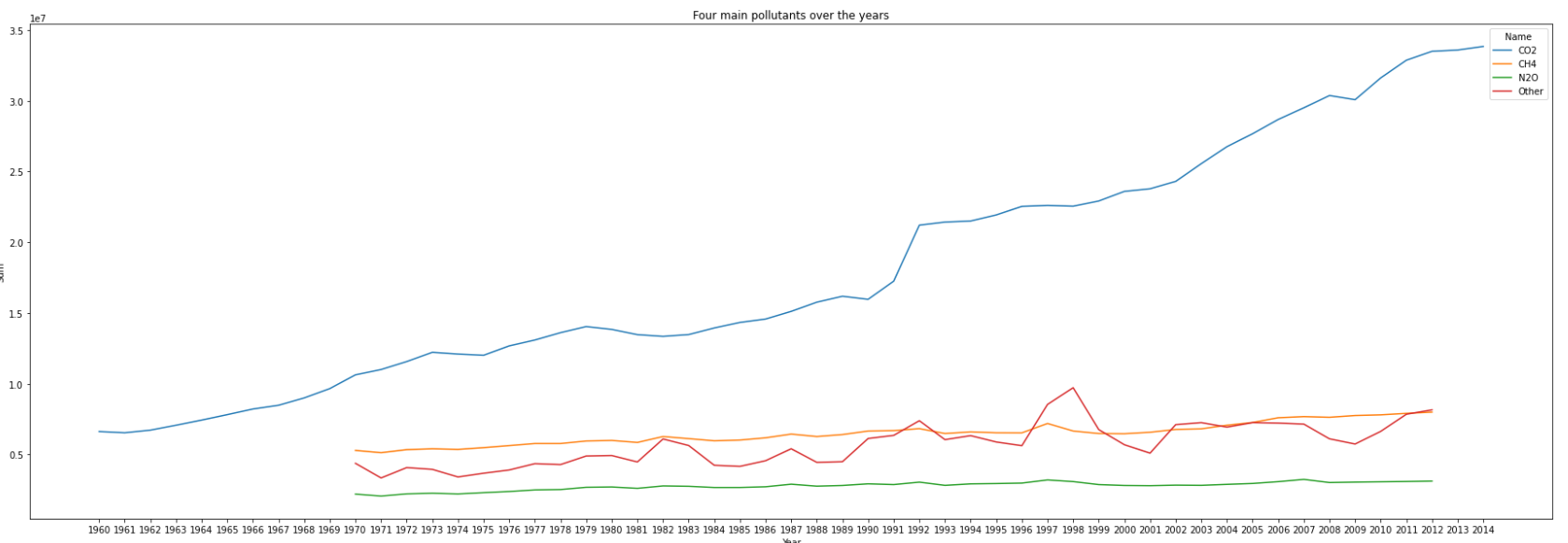
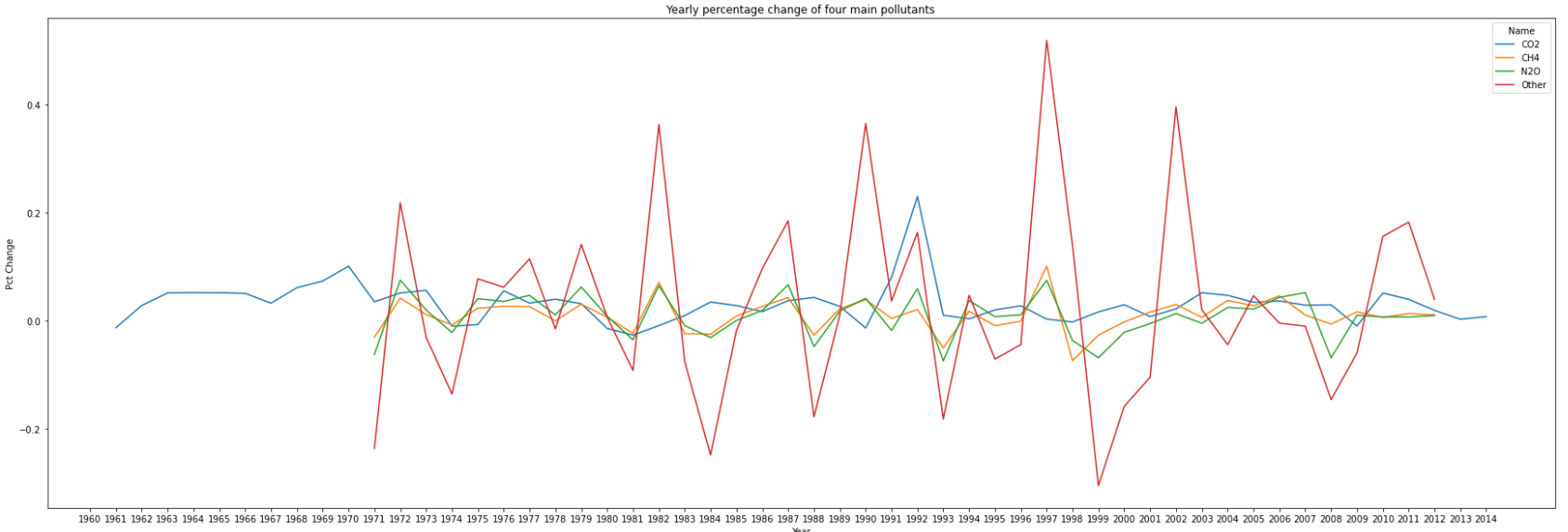
- Among the 60 years(from 1960 to 2019), we only have 55 datas(from 1960 to 2014) of emission for CO2, and 43 datas(from 1970 to 2012) of emission for the other three pollutants
- There is an upward trend in the amount of emissions for each of the four main pollutants, especially for CO2.
- Among the four main pollutants, the increase rate of CO2 is the highest, and there is a steep growth from 1991 to 1992
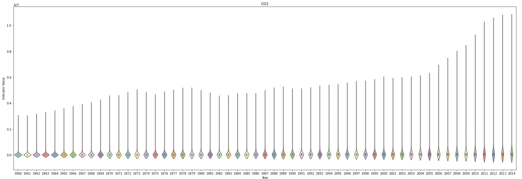
Distribution of emissions
What can you say about the distribution of emissions around the globe over the years? What information can you extract from the tails of these distributions over the years?
for p in main_pollutants:
    plt.figure(figsize = (30,10))
    plt.title(p)
    # sns.stripplot(x="Year", y="Percent", data=main_pollutant_df[main_pollutant_df['Name']==p], palette="Set3", s=1,hue='Peak')
    # sns.boxplot(x="Year", y="Indicator Value", data=main_pollutant_df[main_pollutant_df['Name']==p], palette="Set3",hue='Peak',orient="vertical",showfliers=False)
    sns.violinplot(x="Year", y="Indicator Value", data=main_pollutant_df[main_pollutant_df['Name']==p], palette="Set3",orient="vertical",showfliers=False)
    plt.show()
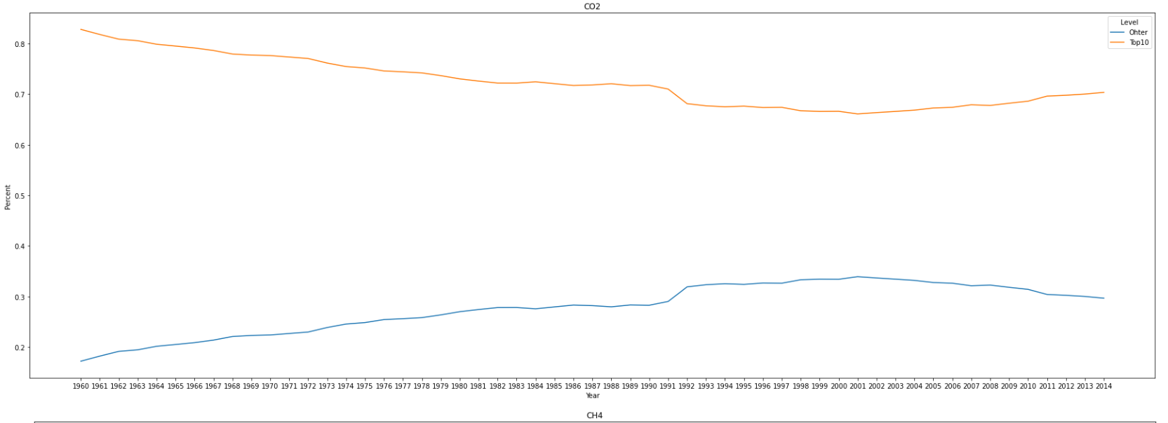
main_pollutant_df['Percent']=main_pollutant_df['Indicator Value']/main_pollutant_df.groupby(['Year','Name'])['Indicator Value'].transform('sum')
main_pollutant_df['RN'] = main_pollutant_df.sort_values(['Indicator Value'], ascending=[False]).groupby(['Year','Name']).cumcount() + 1
main_pollutant_df['Level'] = main_pollutant_df['RN'].apply(lambda x:'Top10' if x<=10 else 'Ohter')
sum_level_df = main_pollutant_df.groupby(['Year','Name','Level'])['Percent'].sum().reset_index()
for p in main_pollutants:
    plt.figure(figsize = (30,10))
    plt.title(p)
    sns.lineplot(data = sum_level_df[sum_level_df['Name']==p], y= 'Percent', x = 'Year', hue = 'Level')
    plt.show()
- The violin plot shows that the amount of emissions for each of the four main pollutants has a long tail every year.
- Top 10 countries contribute more than a half of the emissions around the world
- To the top 10 countries, there is a downward trend in the percent of emissions for CO2 and other pollutants, while an upward trend for CH4 and N2O
Different regions
Compute a plot showing the behavior of each of the four main air pollutants for each of the main global regions in the Emissions_R_df data frame. The main regions are 'Latin America & Caribbean', 'South Asia', 'Sub-Saharan Africa', 'Europe & Central Asia', 'Middle East & North Africa', 'East Asia & Pacific' and 'North America'. What conclusions can you make?
Compute a plot showing the behavior of each of the four main air pollutants for each of the main global regions in the Emissions_R_df data frame. The main regions are 'Latin America & Caribbean', 'South Asia', 'Sub-Saharan Africa', 'Europe & Central Asia', 'Middle East & North Africa', 'East Asia & Pacific' and 'North America'. What conclusions can you make?
- To East Asia & Pacific: a. There is a steep upward trend in the amount of emissions for CO2 and CH4, especially after 2001. b. There is a steady upward trend in N2O over the years c. Before 1997, there is a also an upward trend in Other pollutants, while reverse after that.
- The marjority of the other main regions have an increasing amount of emissions for the four main pollutants, excluding Europe & Central Asia.
It seems that countries in East Asia and the Pacific are the worst dealing with pollutant emissions. We also see that Europe and Central Asia have been making some efforts to reduce their emissions. Surprisingly this is not the case with North America and Sub-Saharan Africa, which levels have been increasing over the years as well.
Top five countries emit most over the years
Which are the top five countries that have been in the top 10 of CO2 emitters over the years? Have any of these countries made efforts to reduce the amount of CO2 emissions over the last 10 years?
sum_CO2_df = main_pollutant_df[main_pollutant_df['Name']=='CO2'].groupby('Country Name')['Indicator Value'].sum().reset_index(name='Sum').sort_values(by="Sum", ascending=False)
print(sum_CO2_df.head(10))
# print(main_pollutant_df[(main_pollutant_df['Name']=='CO2')&(main_pollutant_df['RN']<=5)].groupby(['Country Name'])['Year'].count().reset_index(name='Year Count').sort_values(by="Year Count", ascending=False).head(10))
plt.figure(figsize = (30,10))
plt.title('Top 5 of CO2 emitters over the years')
sns.lineplot(data = main_pollutant_df[(main_pollutant_df['Name']=='CO2')&(main_pollutant_df['RN']<=5)], y= 'Indicator Value', x = 'Year', hue = 'Country Name')
plt.show()
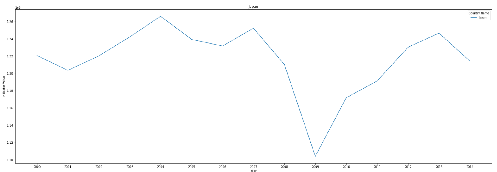
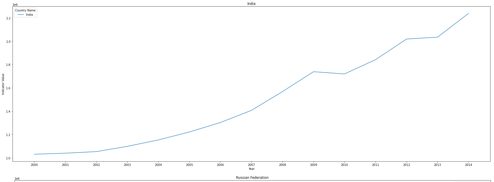
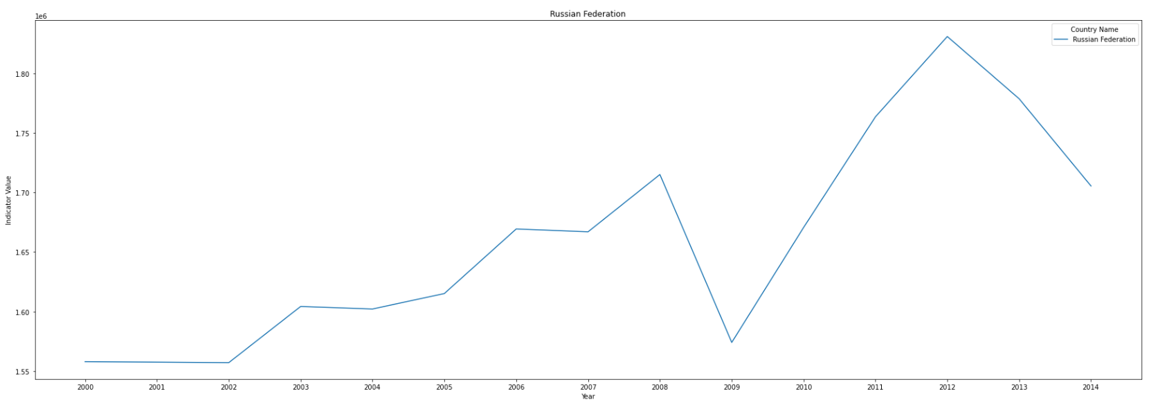
top5_countries = ['United States', 'China', 'Japan', 'India','Russian Federation']
for c in top5_countries:
plt.figure(figsize = (30,10))
plt.title(c)
sns.lineplot(data = main_pollutant_df[(main_pollutant_df['Name']=='CO2')&(main_pollutant_df['RN']<=5)&(main_pollutant_df['Year'].astype('float')>=2000)&(main_pollutant_df['Country Name']==c)], y= 'Indicator Value', x = 'Year', hue = 'Country Name')
plt.show()
results:
           Country Name           Sum
196       United States  2.597893e+08
39                China  1.704215e+08
94                Japan  5.197259e+07
86                India  3.876964e+07
153  Russian Federation  3.838037e+07
195      United Kingdom  3.100135e+07
34               Canada  2.341059e+07
66               France  2.145337e+07
92                Italy  1.978202e+07
71              Germany  1.961740e+07
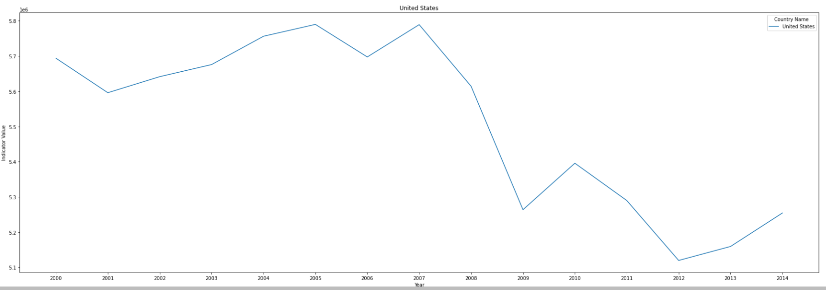
- Top 5 countrys are United States, China, Japan, India and Russian Federation.
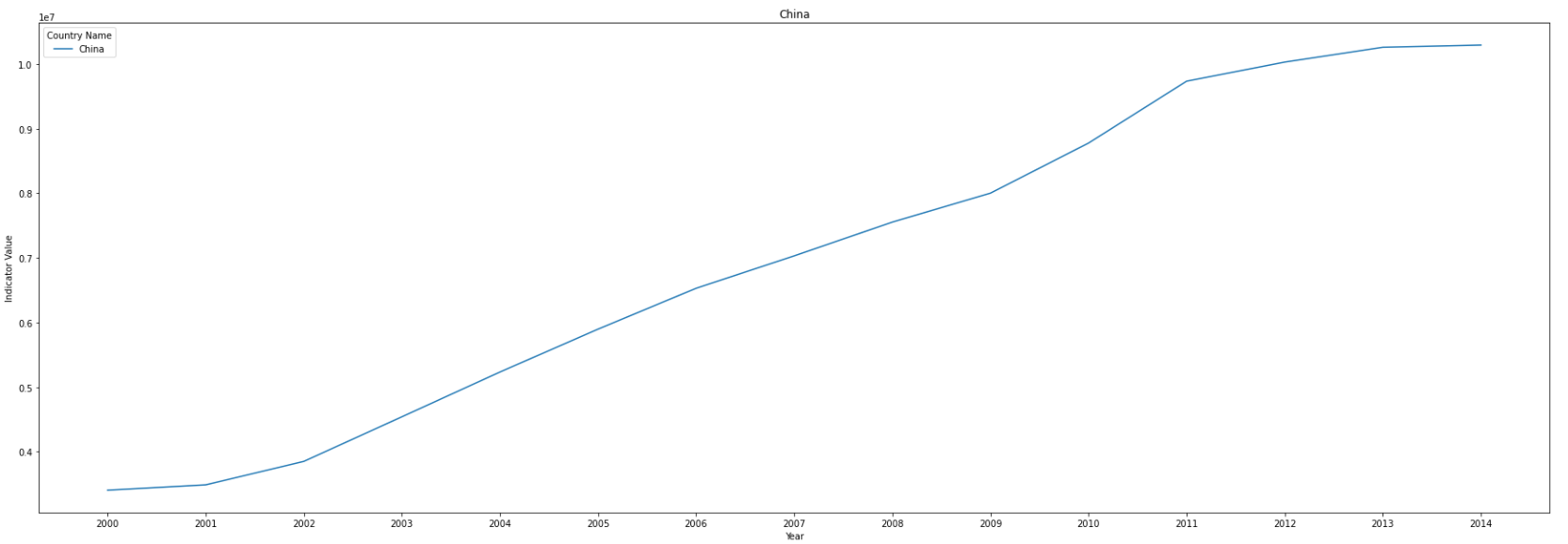
- United States has reduced the emission since 2007, Japan and Russian Federation also reduce after 2013, while there is still an upward trend in China and India.
- China slows down the growth rate of emission after 2011.
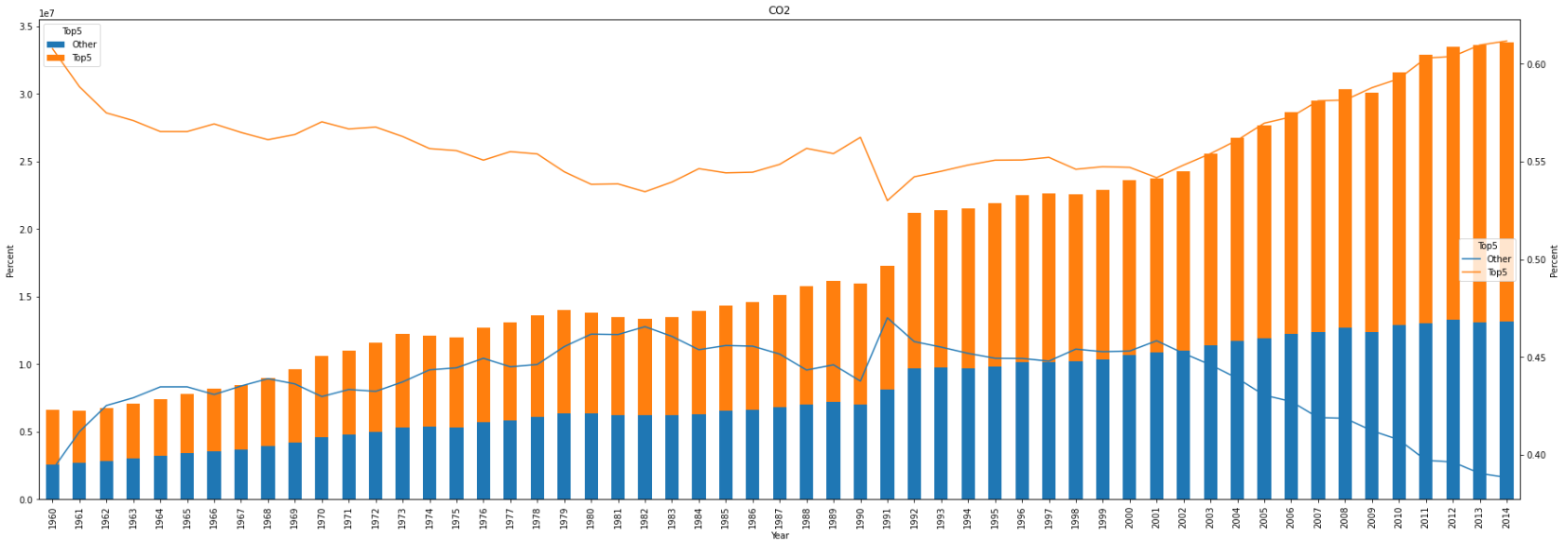
Burden of most of the emissions
Are these five countries carrying out the burden of most of the emissions emitted over the years globally? Can we say that the rest of the world is making some effort to control their polluted gasses emissions over the years?
main_pollutant_df['Top5'] = main_pollutant_df['Country Name'].apply(lambda x:'Top5' if x in top5_countries else 'Other')
sum_top5_df = main_pollutant_df.groupby(['Year','Name','Top5'])['Percent','Indicator Value'].sum().reset_index()
top5_pivot_df = sum_top5_df.pivot(index=['Year','Name'],columns='Top5',values='Indicator Value').reset_index().set_index('Year')
# top5_percent_pivot_df = sum_top5_df.pivot(index=['Year','Name'],columns='Top5',values='Percent').reset_index().set_index('Year')
for p in main_pollutants:
    f,ax1 = plt.subplots()
    ax1.set_ylabel('Indicator Value')
    top5_pivot_df[top5_pivot_df['Name']==p][['Other','Top5']].plot(figsize = (30,10),kind='bar',stacked=True,title=p,ax=ax1) #,secondary_y=True
    ax2 = ax1.twinx()
    ax1.set_ylabel('Percent')
    sns.lineplot(data = sum_top5_df[sum_top5_df['Name']==p], y= 'Percent', x = 'Year', hue = 'Top5',ax=ax2)
    plt.show()
The health impacts of air pollution
One of the main contributions of poor health from air pollution is particulate matter. In particular, very small particles (those with a size less than 2.5 micrometres ( 𝜇
m)) can enter and affect the respiratory system. The PM2.5 indicator measures the average level of exposure of a nation's population to concentrations of these small particles. The PM2.5_WHO measures the percentage of the population who are exposed to ambient concentrations of these particles that exceed some thresholds set by the World Health Organization (WHO). In particular, countries with a higher PM2.5_WHO indicator are more likely to suffer from bad health conditions.
Relationship between the PM2.5_WHO indicator and gdp
We would like to know if there is any relationship between the PM2.5_WHO indicator and the level of income of the general population, as well as how this changes over time.
PM_WHO_df = Emissions_C_df[Emissions_C_df['Name']=='PM2.5_WHO'][['Year','Country Code','Country Name','Name','Income Group','Indicator Value']]
plt.figure(figsize = (30,10))
plt.title(g)
sns.swarmplot(x="Year", y="Indicator Value", data=PM_WHO_df, palette="Set3",orient="vertical",hue='Income Group')
plt.show()
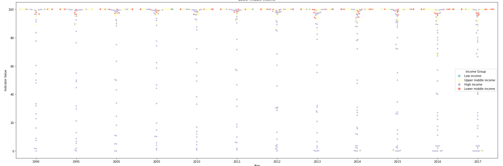
- It seems that the indicator of PM2.5_WHO was collected once every five year from 1990 to 2010, and once a year since 2011. These may be the reason that the count of PM2.5_WHO indicator(2328) is much less than that of CO2(9856).
- The average of the emissions of PM2.5_WHO in High income countries(77) is much lower than others(98+), and the emission is higher when the income lower.
The causes behind the results might be:
- Income: When income increases, people are more willing to pay for environmental protection and reducing pollution.
- Technology Level: High income countries have more methods to generate energy rather than burning fuels which will emit a lot of fine particles.
- Industrial Structure: At the early stage of development, industrial activities dominate, resulting in higher natural resources consumption and severer environmental degradation; later, as high-tech industry and service sector gradually replace energy intensive industry, the impact of economic activities on environmental pressure becomes smaller.
Impacts and relationships between high levels of exposure to particle matter and the health of the population.
Finally, we are interested in investigating the impacts and relationships between high levels of exposure to particle matter and the health of the population. Coming up with additional data for this task may be infeasible for the client, thus they have asked us to search for relevant health data in the WDIdata.csv file and work with that.
WDISeries_df = pd.read_csv('./files/WDI_csv/WDISeries.csv')
print(WDISeries_df[WDISeries_df['Long definition'].str.contains('air pollution')][['Series Code','Indicator Name']].sort_values(by='Indicator Name'))
SH.STA.AIRP.P5,SH.STA.AIRP.FE.P5,SH.STA.AIRP.MA.P5 which are indicators of mortality rate attributed to air pollution might be useful to solve the question.
mortality_rates=['SH.STA.AIRP.P5','SH.STA.AIRP.FE.P5','SH.STA.AIRP.MA.P5']
mortality_pattern = '|'.join(mortality_rates)
mortality_df = WDI_data[WDI_data['Indicator Code'].str.contains(mortality_pattern)][WDI_data.columns[:-1]]
# print(mortality_df.shape)
mortality_df = pd.melt(mortality_df,id_vars=mortality_df.columns[:4],value_vars=mortality_df.columns[4:],var_name='Year', value_name='Indicator Value')
# print(mortality_df.shape)
mortality_df = mortality_df.dropna(subset=['Indicator Value'])
# print(mortality_df.shape)
PM_df = Emissions_C_df[Emissions_C_df['Name']=='PM2.5'][['Year','Country Code','Country Name','Name','Income Group','Indicator Value']]
mortality_PM_df = mortality_df.join(PM_df.set_index(['Year','Country Code','Country Name']),on=['Year','Country Code','Country Name'],how='inner',lsuffix='_mortality', rsuffix='_pm')
# mortality_PM_df = mortality_df.join(PM_df.set_index(['Year','Country Code']),on=['Year','Country Code'],how='inner',lsuffix='_mortality', rsuffix='_pm')
# print(mortality_PM_df.head())
plt.figure(figsize = (30,10))
plt.title(g)
sns.scatterplot(x="Indicator Value_pm", y="Indicator Value_mortality", data=mortality_PM_df, palette="Set3",hue='Indicator Code')
plt.show()
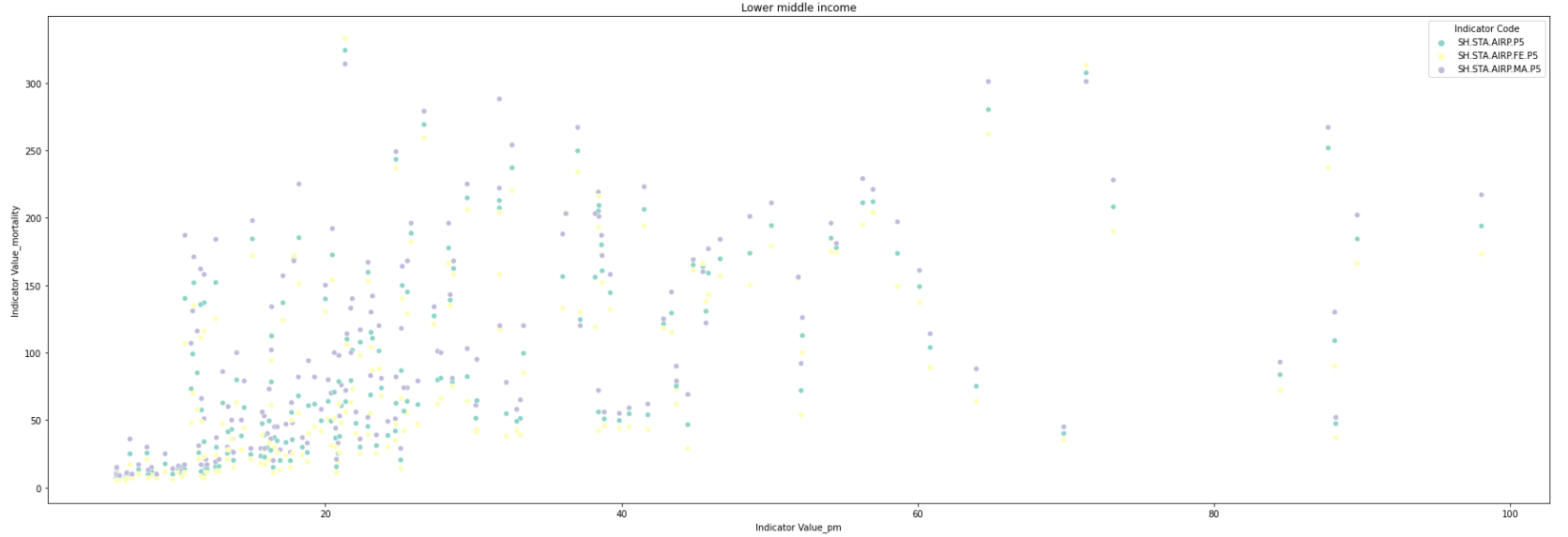 mortality rate has a positive correlation with the PM2.5 indicator which measures the average level of exposure of a nation's population to concentrations of these small particles.
Mortality data by income
We expect higher income countries to have lower pollution-related mortality. Find out if this assumption holds. Calculate summary statistics and histograms for each income category and note any trends.
plt.figure(figsize = (30,10))
plt.title(g)
sns.swarmplot(x='Income Group', y="Indicator Value_mortality", data=mortality_PM_df, palette="Set3",orient="vertical",hue='Indicator Code')
plt.show()
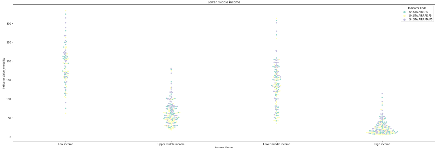 mortality rate has a negative correlation with the income level.
Q&A
Q1: Are we making any progress in reducing the amount of emitted pollutants across the globe?
- We have make progresses to slow down the growth rate of the amount of emitted pollutants across the globe, but we can do more.
Q2: Which are the critical regions where we should start environmental campaigns?
East Asia & Pacificis the critical region we should start environmental campaigns.
Q3: Are we making any progress in the prevention of deaths related to air pollution?
- Since we only have the pollution-related morality data over 2016, it is difficult to analysis the variety over the years, so we can't make a conclusion on whether we have maked any progress in the prevention of deaths related to air pollution.
Q4: Which demographic characteristics seem to correlate with the number of health-related issues derived from air pollution?
- Income level.